Walton: A Clean, Confident Display Typeface for Digital Brands
It started with a hero section that felt… safe. Not bad—just quiet. I’d spent hours refining the layout of a boutique coaching site: thoughtful spacing, intentional color contrast, a soft image background. But the headline? It sat there like polite wallpaper—legible, yes, but not commanding. That’s when I swapped in Walton. Instantly, the whole section exhaled. The font didn’t shout—it leaned in, calm and self-assured—and everything else around it suddenly felt more intentional.
What Walton Brings to the Screen
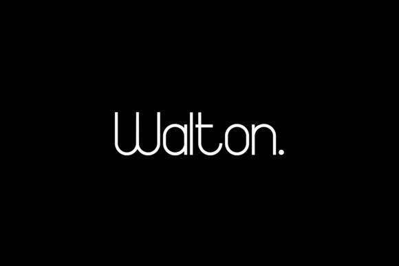
Walton is a minimalist display typeface built for impact, not ornamentation. It’s clean-lined, lightly geometric, and quietly confident—no exaggerated serifs, no dramatic swashes, no forced personality. What makes it special online is how it balances presence with restraint. On a high-resolution desktop screen, its open letterforms and generous x-height create clarity at large sizes. On mobile? It holds up remarkably well—even at 48px on a narrow viewport, it feels crisp, legible, and uncluttered. It’s not trying to be everything; it knows exactly what it’s for: headlines, banners, and moments where your brand needs to say something clear and memorable.
Real Layout Testing: Where Walton Shines
I tested Walton across several live scenarios—not just mockups, but actual staging environments with real content and responsive breakpoints:
- Landing page hero: Paired with Inter (a neutral, highly readable sans serif) for body copy, Walton gave the headline weight without overwhelming the CTA button or image overlay. Its even stroke contrast ensured readability over both light and dark backgrounds.
- Product feature section: Used for subheadings (“Clarity First,” “Simple by Design”)—short phrases where tone matters more than length. The font’s subtle rhythm made each line feel considered, not generic.
- Blog post headers: Applied to H2s across a redesigned editorial layout. It created visual hierarchy without competing with the serif body font (Lora), giving posts a modern yet grounded voice.
- Mobile navigation banner: At 36px on iOS Safari, it remained sharp and friendly—no blurring, no awkward kerning traps. Not ideal for full menus, but perfect for a top-bar tagline like “Design That Listens.”
Readability & Responsiveness: Practical Notes
Walton isn’t meant for paragraphs—and that’s a strength, not a limitation. Its design prioritizes display use, so avoid using it for body text, form labels, or dense interface elements. For accessibility and usability, stick to it for headings, short calls-to-action, and branded accent text. In practice, I found it performs best between 32–72px on desktop and 28–48px on mobile. Below 24px, detail starts to soften—fine for a subtle logo lockup, but not for functional UI text.
It also handles overlays beautifully. Over a textured photo background or a muted gradient, Walton’s clean shapes hold their shape without needing heavy text shadows. And because it’s a single-weight display font (with optional stylistic alternates depending on the version), it loads quickly—no webfont bloat from multiple weights unless you intentionally add them.
Smart Pairing for Digital Harmony
Walton thrives in contrast. I consistently paired it with a warm, humanist sans serif—like Poppins or Manrope—for body copy, buttons, and navigation. Their rounded terminals and open apertures complement Walton’s quiet geometry without mimicking it. For more editorial or premium-feeling sites, I tried pairing it with a refined serif (Cormorant Garamond) for blog headers—creating a sophisticated, magazine-like cadence. Avoid pairing Walton with other display fonts or decorative scripts; its minimalism gets lost in the noise.
One note on licensing: Before deploying Walton on a client site or SaaS dashboard, double-check that your license includes webfont usage and supports the number of pageviews or domains you need. Most commercial versions include WOFF2 files optimized for speed, plus basic OpenType features—ligatures aren’t necessary here, but stylistic alternates (like a slightly taller ‘t’ or simplified ‘g’) can add subtle polish to headlines.
When to Reach for Walton—and When to Pause
Reach for Walton when you need a headline that feels both modern and timeless—ideal for portfolio sites, course sales pages, creative agency banners, or boutique e-commerce headers. It works especially well for brands that value clarity, calm confidence, and understated sophistication.
Pause before using it for: long navigation labels, data-dense dashboards, forms requiring high scannability, or any context where users need to parse information quickly under time pressure. It’s not a workhorse font—and that’s why it’s so effective as a display typeface. Let it anchor your message, then let your body font do the lifting.
In the end, Walton doesn’t try to solve every typographic problem. It solves one beautifully: how to make a digital first impression that feels intentional, human, and quietly powerful. It’s become my go-to for projects where less really is more—and where the right font doesn’t just look good, but helps the whole experience feel more trustworthy, more cohesive, more like itself.