Stark: A Bold Display Typeface for Digital Branding
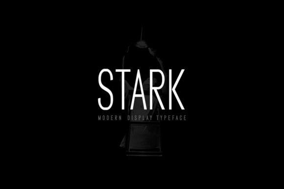
As a UI designer who ships landing pages, SaaS dashboards, and e-commerce experiences daily, I treat typography like interface logic — every font choice affects scanning speed, emotional resonance, and conversion flow. Stark stands out in my toolkit because it’s not just decorative; it’s functional boldness. This all-caps display typeface draws from cinematic poster language — tight spacing, confident letterforms, and subtle geometric tension — but it’s engineered for digital clarity, not print nostalgia.
Stark works best where attention must land instantly: hero headlines, product name tags, section dividers, and branded CTA buttons. Its uppercase-only structure eliminates lowercase ambiguity on small screens, and its generous x-height ensures legibility even at 24px on mobile viewports. Unlike many display fonts that sacrifice readability for flair, Stark maintains consistent stroke contrast and open counters — critical when rendering over image overlays or gradient backgrounds common in modern web design.
In practice, I use Stark to anchor visual hierarchy without competing with interface elements. On a coaching website, pairing Stark with a neutral sans serif like Inter or Manrope creates instant tonal contrast: Stark declares the brand voice (“Clarity. Confidence. Action.”), while the body font delivers calm, scannable guidance. For an online boutique, I apply Stark only to category banners and product name slugs — never to price tags or descriptions — preserving cognitive load balance. It’s a strategic accent, not ambient noise.
Its strength lies in restraint. Stark isn’t meant for paragraphs, navigation menus, or form labels. It shines in short, high-impact contexts: a course title on a sales page (“Master Product Design”), a logo lockup for a creative studio, or a headline overlay on a hero video. I’ve tested it across devices — it holds up cleanly on iOS Safari, Chrome Android, and even older Edge versions — thanks to well-hinted WOFF2 files and responsive fallback behavior baked into most modern webfont services.
Readability in context matters more than theoretical metrics. On light backgrounds, Stark’s sharp terminals pop with precision. Over dark gradients or muted photography, I increase letter-spacing by 2–3% in CSS to prevent visual crowding. For buttons, I cap usage to 20–24 characters max — longer phrases lose impact and invite truncation on mobile. And yes, I always test contrast ratios: Stark meets WCAG AA at 32px+ on white, but drops below at 18px on off-white — so I reserve it for large-scale emphasis only.
Font pairing is where Stark reveals its versatility. With minimalist sans serifs (e.g., Inter, Poppins, or IBM Plex Sans), it reads as confident and contemporary. Against a warm serif like Cormorant Garamond or Literata, it adds editorial authority — ideal for content-led brands launching digital magazines or premium courses. Avoid pairing it with other display or script fonts; Stark’s personality dominates, and visual competition dilutes brand cohesion. Think of it as the lead vocalist, not the backing band.
I’ve deployed Stark across varied digital products: a portfolio site for a motion designer (used exclusively in the hero + project titles), a DTC skincare launch (logo + banner headlines only), and a no-code tool’s feature cards (where each card header uses Stark to signal innovation). In every case, the font reinforced tone without sacrificing usability. Users didn’t “notice the font” — they absorbed the message faster and associated the experience with intentionality.
Stark ships with multiple weights — Light, Regular, Bold — and includes stylistic alternates for key letters (like a sharper ‘A’ or condensed ‘M’) that help fine-tune rhythm in tight layouts. It supports Latin-based languages out of the box and offers optional extended character sets for Central European and Turkish. Webfont kits include WOFF2, WOFF, and EOT for legacy compatibility, plus CSS variable support for dynamic weight scaling in modern frameworks.
Licensing is straightforward but essential to clarify: Stark is a commercial font, and standard licenses cover websites, client projects, SaaS interfaces, and digital templates — including embedded use in Figma design systems and exported HTML prototypes. If you’re selling a theme, plugin, or template that bundles Stark, you’ll need an extended license. Always verify permissions before shipping to production, especially for public-facing stores or white-labeled apps. Missteps here risk legal exposure and inconsistent rendering if fallbacks aren’t defined.
What makes Stark durable beyond trends is its balance of personality and precision. It doesn’t shout — it commands space with economy. That’s rare in display fonts, where excess ornamentation often undermines digital performance. When your goal is to make visitors feel the brand’s confidence before they read a single sentence, Stark delivers that impression — cleanly, consistently, and without compromise.
For designers building for conversion, clarity, and brand longevity, Stark isn’t just another display font. It’s a deliberate typographic decision — one that aligns visual tone with user intent, strengthens hierarchy without clutter, and scales gracefully from desktop hero sections to mobile app splash screens. Used thoughtfully, it becomes part of the interface’s logic — not just its decoration.