Woldacky: A Bold Display Font for Digital Branding
I was deep in a redesign for a boutique coaching site—hero section open, Figma tab blinking—and needed something that felt alive. Not just “clean” or “minimal,” but unmistakably human: raw, confident, and grounded in real expression. That’s when I dropped Woldacky into the headline. Instantly, the page stopped feeling like a template and started feeling like a voice.
What Woldacky Brings to the Screen
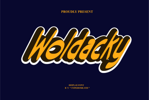
Woldacky is a display font rooted in urban art—think chalked murals, hand-painted signs, and layered street typography. It’s not polished perfection; it’s intentional texture, subtle asymmetry, and rhythmic weight shifts that give it authenticity. The letterforms carry grit without sacrificing clarity: strong x-heights, open counters, and confident stroke endings make it legible even at medium sizes on screen. As a display font, it’s built for impact—not paragraphs, but presence.
In practice, Woldacky thrives where you want attention and attitude: hero headlines, section dividers, CTA buttons with personality, and branded banners. On the coaching site, I used it for the main headline (“Clarity Starts Here”) over a soft gradient background—and the contrast between its bold, slightly irregular shapes and the calm backdrop created instant visual hierarchy. No extra effects needed. Just type, color, and confidence.
Real-World Web Performance
I tested Woldacky across devices and contexts: desktop, tablet, and mobile; light and dark modes; image overlays and solid-color sections. At 48px on desktop, it’s commanding. At 32px on mobile, it remains readable—especially with generous letter spacing (I added 0.05em tracking in CSS). But I did notice it starts to lose definition below 24px, so I avoided it for subheadings or caption text.
It performs especially well in high-scan areas: users landing on a course sales page instantly lock onto the headline (“Your First Module Launches Friday”), and the font’s energy subtly reinforces urgency and creativity. For a portfolio site I tested next, Woldacky worked beautifully as a section label—“Work,” “Process,” “Studio”—giving each area distinct tonal weight without needing icons or illustrations.
Pairing It Right (No Guesswork Needed)
Like any strong display font, Woldacky shines brightest when paired thoughtfully. I consistently paired it with a neutral, highly legible sans serif—like Inter or Manrope—for body copy, navigation, and form fields. That contrast does two things: it lets Woldacky breathe as a statement, and it keeps the interface functional and accessible.
I also experimented with pairing it against a quiet serif (e.g., Lora) for blog headers—surprisingly effective for editorial-style sites where warmth and authority matter. What didn’t work? Pairing it with another decorative font, or trying to use it alongside tight, geometric sans serifs that clashed in rhythm. Trust the contrast. Let Woldacky be the spark; let your body font be the steady flame.
Web-Safe Usage & Practical Checks
Before deploying, I verified key technical details: Woldacky includes web-optimized OTF and WOFF2 files, multiple weights (Regular, Bold, and Black), and basic Latin multilingual support—enough for English, Spanish, French, and German markets. No ligatures or stylistic alternates cluttered the set, which kept file sizes lean (<120KB total for all weights). That matters for Core Web Vitals, especially on shared hosting or lightweight CMS setups.
Licensing was straightforward—commercial use included, with clear terms for client work and SaaS platforms. I double-checked that embedding via @font-face worked cleanly in both modern browsers and legacy Edge (it did), and confirmed fallback behavior stayed graceful using a system-ui stack.
One note on accessibility: while Woldacky passes contrast checks against white and dark backgrounds at headline sizes, I avoided using it for interactive elements smaller than 20px (like filter tags or pagination), and never for form labels or error messages. Its decorative nature means it’s best reserved for *communicating tone*, not *conveying function*.
Where It Fits—and Where It Doesn’t
Woldacky elevates landing pages, digital brand kits, campaign microsites, and creative portfolios—anywhere personality drives perception. I used it for a limited-edition workshop banner (“Unlearn. Rebuild. Begin.”), and the font’s slight imperfection made the offer feel more human, less automated.
But it’s not for everything. Skip it for: navigation menus, footer links, pricing tables, dashboard UIs, or any context demanding dense, scannable information. It’s also not ideal for long-form blog intros unless used only for the first line as an accent—its energy can fatigue readers if overextended.
For SVG-based graphics (like animated hero text or social media banners), Woldacky exported cleanly from Figma and rendered crisply at any scale. And for email headers? I tested it as a webfont in Mailchimp—works reliably when paired with a bulletproof fallback stack.
Making It Part of Your Design System
What sold me wasn’t just how Woldacky looked—it was how it behaved. It simplified decisions. Instead of layering textures, shadows, or custom illustrations to convey energy, I could rely on the typeface itself. That consistency strengthened the brand’s visual language across pages, templates, and even social preview cards.
If you’re choosing fonts for a new site—or refreshing an existing one—ask yourself: does this typeface reflect the feeling I want people to have before they read a single word? With Woldacky, the answer is yes—bold, grounded, and unapologetically real.