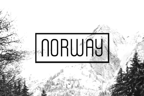
Norway: A Display Font That Makes Your Headlines Instantly Clickable
It’s 9:47 a.m. on launch day — and I’m squinting at my phone screen, refreshing Instagram Stories previews for the third time. The teaser graphic for our new digital toolkit is live in draft mode, but something’s off. The headline feels… soft. Not wrong, exactly — just forgettable in that split-second scroll. I swap out the current sans serif for Norway, bump the size by 8%, and hit preview again. Instant shift: clean, confident, quietly futuristic. That’s the Norway effect — not loud, not flashy, but unmistakably *there*.
Norway isn’t a workhorse text font — it’s a display font built for moments that demand attention without shouting. Think of it as your campaign’s visual handshake: minimalist lines, balanced proportions, subtle techno undertones (a hint of geometric precision, a whisper of Scandinavian clarity). It doesn’t try to be friendly or playful — it’s smart, calm, and effortlessly modern. That makes it ideal for anything where you need instant recognition and zero visual noise: YouTube thumbnails, Pinterest pins, email banners, product launch headers, or even logo-style wordmarks for digital-first brands.
We used Norway across six touchpoints for a recent webinar series on sustainable UX design — and every time, it anchored the message before the viewer even read the first word. On YouTube thumbnails, its crisp letterforms stayed legible even at 120px height. On Instagram Reels covers, it held up beautifully over gradient overlays and motion-blurred backgrounds. And on our Shopify pop-up banner announcing early access? It turned “Join the Waitlist” into something that felt like an invitation — not an interruption.
Here’s what works — and why:
- Short, high-impact text only. Norway shines in headlines, labels (“New,” “Limited,” “Live Now”), quote graphics, and campaign tags (“Summer Edit,” “Beta Launch,” “Free Guide”). It’s not meant for body copy or long paragraphs — and trying to force it there weakens its impact.
- Mobile-first readability, built-in. Its open counters, generous x-height, and consistent stroke weight mean it reads cleanly on small screens — no squinting, no misreading “O” for “0” or “l” for “1.” We tested it across iOS and Android previews, and Norway consistently passed the “thumb-scroll test”: legible at glance, memorable after one pass.
- Background versatility. Whether layered over light-mode UI screenshots, dark-mode app interfaces, or textured photography, Norway maintains contrast and presence. On dark backgrounds, we use its regular weight with 10% extra tracking; on light or busy images, bold weight + subtle drop shadow (just 1px) keeps it crisp.
Pairing Norway is where strategy meets instinct. We almost always pair it with a neutral, highly legible sans serif — think Inter, Manrope, or even system fonts like SF Pro or Segoe UI — for all supporting text: subheads, bullet points, CTAs, and captions. That contrast lets Norway breathe while keeping information scannable. For editorial-style campaigns (like our monthly design newsletter), we’ve paired it with a warm, low-contrast serif — not for headlines, but for pull quotes or section dividers — letting Norway anchor the energy while the serif adds quiet authority.
We avoid pairing Norway with script or handwritten fonts unless it’s intentional contrast (e.g., a bold Norway headline above a delicate handwritten tagline for a creative workshop). Too much personality clash dilutes both. And while it *can* stand alone in minimal layouts, Norway gains even more definition when supported by thoughtful spacing, restrained color palettes, and intentional negative space — it’s a font that rewards restraint.
Before locking it into any client or public-facing asset, we always check three things: First, the included weights — Norway comes in multiple weights (Light, Regular, Bold, sometimes ExtraBold), and having at least Regular + Bold gives us flexibility across formats. Second, file formats — we confirm .woff2 for web use, .otf/.ttf for design apps, and verify licensing covers commercial use across ads, templates, and digital products. Third, multilingual support — if the campaign targets EU or Nordic audiences, we double-check glyph coverage for Ø, Å, Æ, and accented characters. (Good news: Norway handles them cleanly.)
In practice, Norway became our go-to for any moment where clarity had to land faster than context could catch up. A Pinterest pin promoting a free Figma plugin? Norway in bold, centered, over a clean UI mockup — no icon needed. An email banner announcing a 48-hour sale? Just “48 HOURS ONLY” in Norway, with the rest in Inter. Even our internal campaign checklist got a refresh: instead of “Week 1 Tasks,” we used “PHASE ONE” in Norway — suddenly, the timeline felt more intentional, more grounded.
It’s not magic — but it is precision. Norway doesn’t distract. It doesn’t apologize. It doesn’t blend. It clarifies. When your audience is scrolling past dozens of messages in under a minute, that kind of quiet confidence isn’t just nice — it’s functional typography. It turns “maybe later” into “I see this — and I get it.”
So next time you’re tweaking that thumbnail, adjusting that banner, or building your first branded template — ask yourself: does this headline need to be understood before it’s even fully registered? If yes, Norway isn’t just an option. It’s the fastest path from noise to notice.