Megum: A Display Font That Elevates Digital Branding
Two weeks ago, I was finalizing the hero section of a new landing page for a boutique digital coaching practice—calm, intentional, and deeply human. The client’s voice is thoughtful but never clinical; their work bridges neuroscience and mindful leadership. I’d been testing several display fonts for the headline “Where Focus Meets Feeling”, and when I dropped in Megum, something clicked—not just aesthetically, but structurally. It wasn’t just “cool.” It felt like a quiet confidence, anchored in craft.
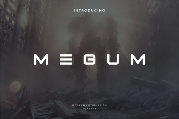
Megum is a display font inspired by vintage Science Fiction Horror cinema—think analog film grain, subtle tension, and elegant restraint. It’s not loud or retro-futuristic; it’s cool in tone, precise in form, and surprisingly versatile. The letterforms have clean terminals, balanced contrast, and a generous x-height that gives them presence without sacrificing readability—even at smaller sizes on mobile. What makes Megum especially effective for web use is how well it holds up with wide letter spacing: it breathes, invites pause, and creates visual rhythm without looking sparse or disconnected.
I used Megum for the main headline and subheading in the hero, paired with a neutral, highly legible sans serif (Inter) for body copy and CTAs. The contrast worked beautifully: Megum set the mood, Inter delivered clarity. On desktop, the headline sat cleanly over a soft gradient background. On mobile, I reduced tracking slightly and increased line height to preserve scannability—no awkward crowding, no loss of elegance. It held up equally well on light and dark modes, and even over a subtle image overlay where other display fonts tended to visually recede or compete.
Megum shines strongest in high-impact, short-form contexts. It’s ideal for hero titles, section headers, course module labels, shop banners, blog post headlines, and campaign taglines. Because it’s designed as a display font—not a text or UI font—it’s not meant for paragraphs, navigation menus, or button labels under 16px. But as a focal point? It builds instant hierarchy. On a portfolio site, it gave weight to project names without overshadowing the work itself. On a product landing page, it made feature headings feel curated, not generic. Even in a digital brand kit I recently built for a small creative studio, Megum became the anchor for all branded web graphics and social cover images—consistent, memorable, and unmistakably intentional.
Readability is where many display fonts falter—but Megum avoids common pitfalls. Its open counters, clear stroke endings, and consistent weight distribution support quick scanning, especially in fast-scrolling environments. I tested it across devices: crisp on Retina screens, still legible on mid-tier Androids, and stable in variable font-weight fallbacks. For buttons or microcopy, I kept it to larger sizes (24px+) with ample padding—and always paired it with a robust, accessible sans serif for supporting text. That pairing isn’t optional; it’s foundational. Megum’s personality needs grounding, and a clean, humanist sans serif (like Inter, Poppins, or Manrope) provides exactly that balance.
Before deploying Megum in any live project, I checked three things: first, its webfont availability—yes, it’s offered in WOFF2 format, optimized for fast loading. Second, its included styles—regular and bold weights, plus true italics (not slanted), which matters for semantic HTML and screen readers. Third, licensing—this is a commercial font, so I confirmed usage rights covered client websites, SaaS dashboards, and digital templates. No surprises later. I also verified basic multilingual support (Latin Extended-A), which covered the client’s bilingual content needs without requiring fallback gymnastics.
One thing I appreciate about Megum is how it supports brand trust—not through sterility or corporate polish, but through considered detail. In a space crowded with overused geometric sans serifs and overly playful script fonts, Megum feels like a deliberate choice. It signals care—not just in aesthetics, but in how information is framed and prioritized. That matters when users land on a course sales page and need to quickly grasp value, or when they scroll a blog and decide whether to stay based on how the headline lands in their peripheral vision.
It’s also refreshingly adaptable across digital contexts. I’ve used it in email header graphics (exported as crisp SVG), in Figma design systems as a tokenized type style, and even scaled down for animated micro-interactions—like a hover effect that gently tightens tracking on a CTA headline. It doesn’t dominate; it enhances. And because it’s not tied to a specific trend (no distressed edges, no exaggerated contrast), it ages gracefully. A redesign two years from now won’t make this font feel dated—it’ll feel like part of a coherent, evolving identity.
If you’re choosing a display font for your next web project, ask yourself: does it serve the message—or just decorate it? Megum serves. It adds gravity to a mission statement, warmth to a personal brand, and distinction to a product launch—all while staying rooted in usability. It won’t solve layout problems on its own, but paired thoughtfully, it helps turn functional interfaces into resonant experiences.
For web designers, UI creators, and digital product teams, Megum is more than a premium font—it’s a tool for tonal precision. Whether you’re building a course platform, a creative portfolio, a coaching website, or a small business landing page, it offers that rare blend: distinctive character, professional polish, and real-world performance.