Design Lines: A Psychedelic Display Font That Cuts Through the Feed
It was 3 p.m. on a Tuesday—two days before launching a new online course series—and I was tweaking the Instagram carousel for the teaser campaign. The first slide needed to stop scrollers cold. Not with motion, not with color alone—but with type that felt like a mood shift. That’s when I dropped in Design Lines.
A Font That Speaks Before You Read It
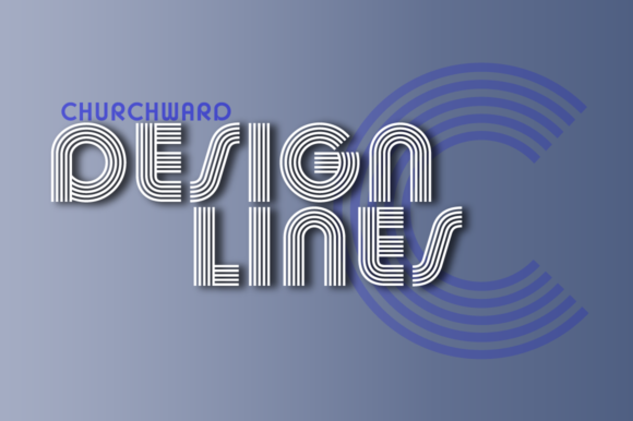
Design Lines is a display font—no question about it. It’s not built for body copy or legal disclaimers. It’s built for impact: clean geometry fused with subtle psychedelic rhythm. Think minimalist techno meets retro-futurism—sharp angles softened by rhythmic spacing, tight letterforms that breathe just enough to feel intentional, not cramped. There’s no excessive ornamentation, but there’s unmistakable personality: smart, slightly irreverent, confidently contemporary.
In practice? It doesn’t shout. It leans in. When used for a headline like “New Sessions Drop Friday” or “Unlock the Framework,” it gives the message a quiet authority—like the design equivalent of a well-timed pause in a presentation. It’s not playful in a cartoonish way; it’s playful in the way a perfectly timed synth arpeggio lands in a track. That makes it unusually versatile for campaigns that want to feel current without chasing trends.
Where Design Lines Actually Shines (and Where It Steps Back)
I tested Design Lines across six real campaign touchpoints:
- Instagram post headers: Works best at 48–72pt on light or dark backgrounds—crisp even in Stories’ small preview thumbnails. Avoid placing it over busy image textures unless you add a subtle background tint or stroke.
- YouTube thumbnails: Paired with bold sans serif subtext (e.g., “Free Module Inside”), it anchors the visual without competing. Its strong x-height and open counters hold up at 120x68px previews.
- Pinterest pins: Stands out in vertical feeds—especially when layered over muted gradients or soft-focus backgrounds. Just keep line length under 35 characters for mobile clarity.
- Digital ad banners (728x90, 300x250): Use only for primary headlines. Never for secondary CTAs or fine print—its character density drops readability below 24pt on small screens.
- Email banners: Scales cleanly in most email clients when embedded as web-safe fallbacks are planned. Always pair with a system font (like Inter or Helvetica) for supporting text.
- Webinar or course launch landing page headers: Delivers instant tone alignment—especially for creative, tech-adjacent, or self-paced learning brands.
What doesn’t work? Long paragraphs. Captions under product photos. Anything requiring immediate comprehension at glance size. And while it adds flair to logo-style wordmarks (e.g., a course title used as a brand lockup), avoid using it for full company names unless the brand voice fully embraces its vibe—think “Studio Neon” not “Midwest Accounting Group.”
Readability Realities: Mobile, Thumbnails & Fast Scrolling
On mobile, Design Lines holds up better than most display fonts—but only if you respect its limits. At 28pt on a dark background with light text, it’s legible. At 18pt on a noisy photo overlay? Not reliably. I found the sweet spot for Instagram Reels covers is 56–64pt with 10% letter-spacing and a 2px white stroke for contrast. For Pinterest, I export as PNG with crisp anti-aliasing—not JPEG—to preserve edge clarity.
Also worth noting: the font includes one weight (Medium) and standard OpenType features—no italics or bold variants. That’s fine for display use, but means you’ll need a strong pairing for hierarchy. No ligatures or stylistic alternates, so don’t expect swashes or contextual flourishes. It’s purpose-built, not kitchen-sink.
Smart Pairings & Practical Licensing Notes
Design Lines thrives when grounded. My go-to pairing is Inter Medium for all supporting text—clean, neutral, highly legible, and free for commercial use. For editorial-style quote graphics or newsletter headers, a restrained serif like IBM Plex Serif adds quiet sophistication without clashing. Avoid script or handwritten fonts—they compete for attention instead of complementing.
Before dropping Design Lines into client work or digital products, always verify licensing. It’s a commercial font, so double-check whether your license covers ads, templates for resale, merchandise, or SaaS platform integration. Some versions include WOFF/WOFF2 for web use; others are desktop-only. If you’re building branded Canva templates or Notion dashboards, confirm multilingual support—Design Lines covers Latin-based languages well, but doesn’t extend to Cyrillic or Arabic glyphs.
When to Reach for Design Lines (and When to Skip It)
Reach for it when:
- You’re designing a limited-run content series (e.g., “Summer Studio Sessions”) and want cohesive, ownable typography across all assets.
- Your brand voice balances intelligence with approachability—and you want visuals to reflect that duality.
- You need a single font to carry visual weight across static and motion graphics without feeling repetitive.
- You’re refreshing a stale banner set and want something that feels modern but not trend-dependent.
Skip it when:
- The campaign relies heavily on data, stats, or dense explanations.
- You’re designing for audiences where formality or tradition signals trust (e.g., financial services, healthcare compliance).
- Text will appear smaller than 24pt in final output—or be overlaid on low-contrast imagery without adjustments.
- Your brand already uses a strong, distinctive custom typeface and consistency matters more than novelty.
Design Lines won’t solve weak messaging—but it will make strong messaging feel unmistakably yours. It’s not flashy for flashiness’ sake. It’s precise, intentional, and quietly magnetic. In a feed full of sameness, sometimes the smartest move is choosing a display font that doesn’t try to be everything—just exactly what your moment needs.